Film Noir Opening Evaluation
Looking back at your preliminary task, what do you feel you have learnt in the progression from it to the full product?
Looking back to my preliminary exercise, even my “Exchange” sequence (the second shooting task, leading to this), I believe my skills have progressed and are displayed in this Film Noir Opening. In my previous work, the quality and cinematography regarding shots, editing and sound were rather raw and depthless and there were instances where the shots would be unintentionally shaky, the sound levels would be almost inaudible and continuity was unrealistic. I think I’ve implemented my trial-and-error experiences in to this piece and learned what makes a good, stable body of work. Equipment is no longer in shot, dialogue is clear, shots are smoother, therefore, this is, as it should be, my best to date. My work is now smoother, better framed, proper use of lighting has benefited, we’ve experimented with non-diegetic sound and improved overall quality. Since the days of my preliminary task, I’ve also learnt a great deal about noir as a genre and stylistically, narrative structure including Todorov and Propp’s theories, a lot about institutions, cinematography rules (such as rule of thirds, 180˚ line etc), ideology and messages, audience and representations. All of this theory has helped a tremendous amount to contribute towards this final piece and I think it’s evident we’ve come a long way; I’m really proud of our work.
What have you learnt about the technologies from the process of making this product?
As editor using Final Cut Pro by Apple, I’ve definitely learnt a lot more than I thought I would during the
post-production. Cutting up video and audio clips, conversion of music files, sound levels, video transitions, rendering clips; it’s all been a really valuable learning experience and I’m glad I know how to do these now. I edited and converted sound in Garageband, which I’m familiar with, but used it very closely with Final Cut Pro to utilise the best aspects of both capabilities and I think it worked well. Once the edit was complete, the video was compressed to a manageable size in quicktime format and although some quality was lost (though not a lot), it made upload/download times faster for the internet and made it accessible to a larger amount of people.
The Canon HV30 DV camcorder was, in all honesty, quite daunting at the start of the year, but again, once I learnt about framing, handles, focus and general cinematography skills, it allowed me to shoot video for this final piece when our cinematographer was absent. We even discovered during the shoot that there’s a really useful light on the front of the camera that provided an amazing effect to some of our shots. The Yoya Shotgun microphone, along with the boom pole was at first, a novelty, but using it and learning about directional sound recording, tips and tricks, I’ve definitely realised the potential in sound quality these provide as opposed to an internal microphone on the cam
era. I’ve found makes the final edit sound that much more professional once you’ve learned the correct way to set it up, wrapping the wire around the boom pole and making sure it’s not in shot, but close enough for clear dialogue or sound effects. Finally, the last piece of kit we used was the Velbon DV-7000 tripod; again, I totally underestimated it’s importance until now. Apart from stability, this ensures clean, smooth shots every time if used correctly and makes pans flawless. The adjustable height makes ideal for high/low angles and I’ve discovered the adjustments are equally important - I used to complain that the shot was jerky due to the tripod until I sat down and properly looked at the configurations and settings each knob had; after this, my shots weren’t shaky anymore. Other technologies I’ve used include; Google Mail to e-mail myself work, notes and media, Facebook and MSN to keep in touch with other members of my group, YouTube to stream video to my blog, SoundCloud to stream music to my blog, Flickr for images and Blogger to actually house my blog.
In what ways does your media product use, develop or challenge codes and conventions of real media products?
 After studying the characteristics and stylistics of noirs, we adapted the style of our micro-elements accordingly to create a dark, mysterious and slightly confusing piece that’s synonymous with the age old genre. Lighting was something we’d never really touched on before but this time made it priority to focus on. Some examples of lighting include; a scene in the flashbacks with flashing lights, the dark, almost cctv-like lighting during the pacing scene and the overexposed shot of myself on the bed. Each of these examples capture the uneasiness of noir lighting that compliment the dark, angular tone of the genre.
I think we’ve used and developed but also developed the noir codes and conventions to create this modern adaption. Taking mise-en-scene, sound and cinematography in to consideration, we were able to recreate the noir feel of the piece. For sound, we knew that voice-overs are a really useful addition to the narrative but also they they’re very noir and mysterious - they allow the audience to get in to the character’s head; which is this case, like noirs, is cloudy, confused and slightly erratic. The narrative we wrote keeps to the genre we’re trying to update.
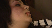
 The narrative is dark and provides a suspicious, thought provoking opening to our noir. The first shot is a girl and boy in bed, but later reveals the girl is dead. The audience has no prior information to her death and as the sequence unravels, multiple suspects are briefly introduced leading to a “who-dun-it” situation - a subject noirs are famous for. Flashbacks are key to our opening narrative and bring genre-specific visual obscurities through strange shots, angles, lighting and framing such as the low angle view of Cameron stumbling up the stairs, high angle Kira and Cameron in the garden, flashing lights party scene and dissolve transitions in the pacing scene.
MES captures quite a seedy, enigmatic, dark location - there are cigarette packets everywhere, dru
g paraphernalia, empty bottles of alcohol, condoms, clothes and the place is generally a dimly-lit mess; perfect for a noir. There are modern day femme fatales in lipstick, dresses and heels smoking cigarettes with glasses of alcohol looking troublesome. The characters’ performance develops the noir codes and conventions by adding modern dialogue, costumes and actions. I think this is why some have compared our noir opening to Skins - but I have to disagree. This is a neo-noir, it has a very noir-like narrative, protagonists, femme fatales, a huge enigma and mise-en-scene wise, combines the two.
 The film openings I analysed included a voice-over, non-diegetic music, a wide variety of shots, and in L.A. Confidential, a montage of shots can be seen before getting darker; similar to our flashback sequences. Looking at these really helped me to understand what does make a good film opening and it comes down to three things for me; the audience need to be provided with enough information to understand what the film is about, the first few shots and the narrative within them must draw your audience in and make them want to watch-on, and finally, the opening to a film must be relevant to the narrative that follows. An enigma really helps, especially when it’s not obvious, to draw the audience in, get them thinking and on the edge of their seats.
Who would be the audience for your media product and how does it represent particular social groups? How have you attracted/addressed this audience?
We’re looking to attract a younger audience here who may not have been exposed to noir before. The contemporary feel to our piece, we hope, will make it much more exciting to watch than original noir films too.
I do think our Film Noir Opening represents and appeals to a variety of demographics but focuses on representations of youths as a whole in terms of social groups. We’ve been quite stereotypical, in that we’ve displayed the typical view of drunk, hard-partying teenagers who cause trouble - but in a darker light. The stereotype is one youths cannot disagree with, they almost embrace it which is why television series displaying similarities have been so popular with teens. Connotations surrounding the youth from older generations are actually confirmed in our piece but the reminiscent narrative structure, alongside the noir codes, conventions and styles, regarding narrative and mise-en-scene will appeal too.
 These points are absolutely key to our choice of exposure - because it intrigues our target audience; primarily late teens. The house-party setting we’ve used is the most familiar (particularly in under 18s) so the location will seem welcoming and ordinary; one they can relate to. In terms of props, we scattered bottles, clothes, condoms, cigarettes and loose change lying around to underline not only the trashy tone, but the darker side of alcohol and parties and it’s dangers if out of control - basically the platform for our narrative.
Demographically, we’re aiming this, stereotypically, at males who are into crime and mystery movies but feel that women will also be interested as they can relate to the female characters we’ve represented in here. The cast of our piece includes a wide range of relatable characters, especially to our target audience; we’ve been diverse in terms of race, sex, social status and age and our fair, accurate representations of those mentioned. Women are strong and independent, age is represented truthfully and social status is reflected welcomingly for our age range aim.
The age range we’re targeting is 15-25 year-olds as we’re likely to be given a BBFC 15 rating due to the paraphernalia, language and narrative of our piece and also, these are the range of people that could relate to our piece; the belongers, emulators, socially conscious and experimental type regarding values and lifestyles. This age rating I mentioned does decrease our potential audience and I think if we scaled it down and sold-out a little bit, we could gain a 12 BBFC rating but I feel scaling down the griminess of our piece will result in far fewer viewers.
Socioeconomically(SES), we’re targeting our piece to middle and low SES groups as I don’t believe the socially high will be interested. I believe these are the people who will be interested in our film and those that watch similar genres to our film. Taking education, income, age, sex and race in to consideration and think that we’ve made the right choices to successfully aim this at our ideal audience.
 The characters we’ve decided to use are mysterious, noir oriented but still very contemporary, which is expressed through costume. There are two ‘femme fatale’ characters in our piece; Kira and Amy. Regarding their costume, bows, dresses, heels and lipstick are worn, which are all reminiscent of women in the genre and represent them as tough independent women. The fact that women are now rightfully seen as tougher independent individuals much more so than in noir’s era brings us closer to our goal and entices female characters too - those who stereotypically wouldn’t watch noirs.
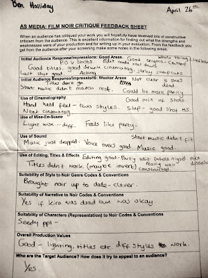
During our feedback session and screening, our test audience agreed that they would be interested in watching our entire film if it were to be made. The criticism we got at this time was constructive and fair. Some positive assessments commented on our really contemporary viewpoint whilst holding on to the noir stylistics, the enigma surrounding our piece and how the cinematography made them feel unstable - as if they were too drunk. Noirs, typically, don’t appeal to teens that much but the contemporary feel of ours brings the genre to them in a much more accessible way by including familiar characters, props and locations. The fact no-one knew why the girl was dead, who killed her and what happened the night before really does provide that gripping mystery that makes people want to watch on and explore. One thing that was picked up on during our screening though, which I completely agree with, is Kira’s death is not made as clear as it could be. If I were to re-shoot this piece, I definitely would have checked her pulse for audience clarification.
What kind of media institution may distribute your media product and why?
As our film is a relatively low-budget British film, we’re very unlikely to get a major release which is okay. We’d be looking for a small distribution deal for TV and independent cinemas or local art-house-screenings. Technology also allows us to cheaply distribute our film online, making our potential audience much larger as well as marketing; we can place banners and adverts on websites as well as our distributor’s or exhibition’s website and gain viewers that way.
The type of media institution to distribute our film, I feel, would be independent as we’ve worked with a genre that’s not particularly mainstream, we worked with a low budget and little resources too. I think a small institution such as Film Four would be perfect to distribute our film due to the small size, history and popularity. Run by Channel 4, vast amounts of money has been invested into distribution and production in the past which will be really helpful to get our film out there. Their history of producing and distributing some small, independent films with dark, British, eerie tones definitely fits in with both our piece but the direction I feel we should regarding distribution.
Through a small amount of marketing, word-of-mouth and critical acclaim, we’re hoping our film will gain popularity and we can build a strong audience. Local press, posters, even online marketing such as social networking and video pages dedicated to our film will definitely market our film to a large accessible crowd with little effort or resources.
Two Examples of Films Opening Sequences: L.A. Confidential.
1997
Directed By: Curtis Hanson
Like Bridget Jones, we're introduced first hearing music; in this instance, old style jazz music (relevant to noir) as we fade into a postcard from California. The voice over starts and talks about L.A. in an almost holiday representative manner. They really want you to know where this is set and this makes the location seem extremely important. A serif-style, quite grand typeface appears in yellow, introducing the institutions and companies that contributed towards the film.
We then see a a huge montage of shots. Mise-en-scene wise, it's notable that this is not set in the time it was released; outfits and general style is very 70's, the colours generally are faded and dull, and the shots are blurred. Still seemingly trying to "sell" L.A. to the audience, the voice-over continues as a montage of similarly styles shots appear.
Introduced to a split screen of four different shots, "L.A. Confidential" logo is places in the middle, as all shots show factory work. Cutting to a single screen, the movie title still there, we see a birds eye view of L.A. scenery as the jazz music continues.
Another set of montages, still in a very old-fashioned style continues. We see pool scenes, a family at a dinner table, suburban streets as the non-diegetic voice-over corresponds to the shown shots. Religious imagery is shown as the family are at the table; notably a white family of two males, two females which contributes the idea of 'the American dream'.
Furthering that idea, the montage continues, but shows very glamourous shots of camera-flashes, actresses, red carpet events etc. more imagery is shown, but reffering to police and drug crime. We're shown shots of TVs with cop shows on them as the voiceover gives us information about "the best police-force in the world".
We're introduced to characters in this scene as we enter a very old-school diner and the voice-over exclaims; "It's paradise on earth! haha... that's what they tell ya' anyway. Because they're selling an image; for movies, radio, tv... But. There's trouble in paradise... and his name is Myer Harris Cone." Here, we pan the diner to a long shot of a very well, yuppie-ish dressed man dancing with a woman. His costume shows his wealth and status, social class etc. This makes the audience wonder why is he is dangerous and question what he does, what he's done, why is he so infamous? We enter yet another similar montage, but this time focusing on organised crime. We see close ups of drugs, crime scenes, and most importantly, we zoom in on newspaper headlines.
We now see a reflection of a huge neon-lit building in a reflection of a building window at night. The camera pans around to introduce a character sat at a desk with a typewriter, which we hear far before we see him. The room is darkly lit and he appears to be wearing a shirt, glasses and a trilby hat (also very noir). We notice he's saying the voice over and typing what the voice-over has been all this time so the sound switches to diegetic, but creates more question; who is he? Shot from eye-level, the mid-shot pans around him but then cuts to a pile of magazines, titled "Hush-Hush" which gives the audience the impression he's a journalist of some sort. The shot fades to black and both the music and voice-over end as the same titles that appeared at the beginning titles re-appear.
Breif Addition To The Script
Click to view full-screen.

Ben's Voice-Over:
Whilst pacing: What a stupid bitch! I fucking new something like this would happen. How did she even end up in my bed?! I told her no a million times. No one even wanted her here anyway. Looks like we got what we wanted.
On the bed: Oh my god, what the hell am I going to do? I barely remember a thing! Anyone could have done this – even me…
(Paperwork By: Amy Meitiner, Producerr)
Brief Post on Editing Paperwork
Here are the logging sheets:
(Sorry for the small size: They won't seem to enlarge.)
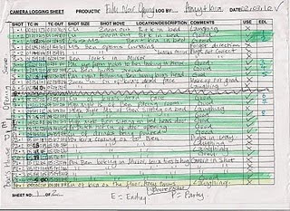
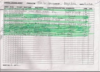
(Log Sheets by: Amy Meitiner & Kira Knight)
Editing Update 3: Editing Techniques
"A Killing Conscience" Audience Feedback
